
Pierre Fredenucci
Sports Buddy
What: Developing a mobile application enabling anyone to schedule a sport game with a few clicks.
When: January 2017 - May 2017
Skills: Design Thinking, Wireframing, UX/UI, mobile application
Where: University of California, Berkeley
Context
This project has been conducted in the class Development of web-based product taught by Professor Thomas Lee. I worked with two MBA students, Diego Bultrich and Vlada Alexandrov, an engineering student, Emilie Dahl.
We conducted the project Sports Buddy, a mobile application helping people scheduling sports games in a few minutes with strangers of similar level.
First step was market and user research. We individually conducted four interviews (16 in total) with various students to gather insights. Analysing these interviews we defined a persona, a use case and a use case instance. Additionally we wrote a press release illustrating how our product would be described if released in the press.
We iterated a few times this user research process in order to narrow down the scope of the job-to-be-done. For example, we were first focused on connecting people AND venues together. However with our market research we realised that finding venues was not the most important problem. In fact scheduling is the most painful step of organising a sport game. That is why we dropped the "venue" feature and reduced our scope to scheduling. In addition, we noticed that playing with people of similar level was also an issue. For now we decided to gamify our app with a rating system but this feature will be validated (or not) during the user testing step.
Sports Buddy - Easily find partners anytime, anywhere, to play your favorite sports!
Berkeley, CA – February 22, 2017 – Have you ever found yourself in the situation where you wanted to play an individual sport, but did not have a partner to play with? You are not alone. Data suggests that more than 80% of the people who exercise regularly have faced this problem, and that 9 of 10 people are open to play sports with someone they do not know, but only 5% actually do it. A team of Berkeley students launched today Sports Buddy, a platform that connects people nearby to make it incredibly simple to play individual sports, helping players to find same level opponents, at the most convenient time for them.
Scheduling an individual sports activity tends to be a painful process. Sometimes, people around you are not interested in the same sports, or are not at the same level you are. Even when you overcome this problem, you still need to agree on a time slot that suits everybody’s schedules.This is how you end up wasting time scheduling one game.
Sports Buddy is looking to eliminate these barriers, connecting you with the right players, anytime, anywhere to play your favourite sports. Whether you want to play for fun or want to be challenged, Sports Buddy enables you to schedule a game with similar players spontaneously.
“We want to encourage more people to play sports by drastically simplifying the process of scheduling a game, anytime you feel like playing. For now Sports Buddy focuses on individual sports but it will soon include team sports.” - remarked Emilie Dahl, a company representative. “We have faith that this product will solve a real problem many people face nowadays, and in doing so, will promote a healthier lifestyle”.
Users are also excited about this new concept. “With Sports Buddy, I won’t struggle ever again to find someone of my same level to play with during my breaks at school. It’s just like Uber, you log-in whenever you want and get it done. I just met Kevin today through Sports Buddy, and we settled a squash game.”
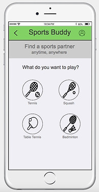
You can see in the press release above that we also decided to focus on individual sports, which makes the rating feature more convenient and relevant.
Then we started user testing with paper prototypes. Each member came up with his own low fidelity wireframes and tested them with a few persons (in-class and outside class). By designing our own prototype we actually generated different concepts around our product.
Process


With the feedback from this first step of user testing, we chose the features we wanted to focus on and started working collectively on medium fidelity wireframes. These were designed with the software Just In mind. We conducted tests such as click tests, navigation tests, landing page tests, etc. with the tool Usability Hub.


Example of paper prototypes wireframes
The results helped us refine our wireframes and modify the user experience so it can be closer to current trends. For example we deleted the "back" button and replaced it by an arrow on the top-left of the screen. Also we deleted the "confirmation" screen (which you can see right above on the right) and created instead a pop-up appearing on the same screen. In addition, we kept on developing our wireframes and created a profile and sign-in/up page to make the interface more realistic. You can see below a few screens illustrating the changes.
Some screens of our medium fidelity prototype
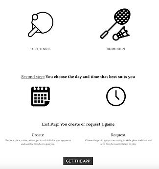
Then we designed a marketing page on Weebly. This page simply describes the purpose of the app and includes a "get the app" call-to-action button. In order to make the home page more effective, we implemented A/B testing on it with Google Content Experiments and Google Analytics. We also launched a Google Adwords campaign to drive traffic through the website and to learn about the usual keywords used by our potential users. Below you can see the two different home pages: both have the same header (picture + short text describing the purpose of the app) and the “Get the app” call-to-action button. Home A (on the left) also includes a description of how the application works. It explains the three main steps the user will have to go through to find an opponent.
The “customer intent” we want to measure here is his interest in the application. If our home page raises enough interest he will click on the call-to-action button to try the application.Since Home page A contains a more complete and detailed explanation of how the app is working, we expect it to have better performances than Home page B. However the results we have after a week of testing is that Home page B achieves a higher rate of conversion than Home page A. Nevertheless for both pages conversion rates are still low. One variable that can explain the differences is of course the content of the app description added in Home page A. Maybe visitors do not find it valuable and may even be confused by it. Also, just having the header may be enough to raise curiosity among visitors and have them click on the call-to-action button. Another variable that can explain the low conversion rate is also the content of the header (same in both pages). Maybe visitors simply do not find it clear and interesting enough to click on the “get the app” call-to-action button.
Finally we carried out remote video testing to analyse further our prototype with usertesting.com. These tests are similar as the click and navigation tests carried out previously except that testers can use the interactive prototype instead of screenshots. Furthermore we have access to their screens and voice while they are taking the test. Hence, we get a lot of insights from their reactions. You can find a demo of our final prototype at this address:
https://www.justinmind.com/usernote/tests/25333076/25356053/25356055/index.html


Home page A on the left, Home page B on the top right and the destination page on bottom left.


Refined screens after taking into account feedback from the various user tests